Jetpack Compose — Android Bottom Sheet

When developing apps in Java, we generally prefer using View Model concept, where UI elements are declared in XML language whereas the functionality is written in java or Kotlin and we link UI elements with our Java or Kotlin class with the findViewbyId() method. But in most apps, we need to use the UI elements to display content dynamically so this may sometimes give you an error of NullRefrence[1].
Jetpack Compose is a modern UI toolkit launched by Google which is used for building native Android UI. It simplifies and accelerates the UI development with less code, Kotlin APIs, and powerful tools[1]. Since Jetpack Compose is written using kotlin, the occurence of the error above should be minimized or even eliminated.
Bottom Sheet
In Jetpack Compose, there are two types of bottom sheets, BottomSheet (Standard) and the ModalBottomSheet.
BottomSheet co-exist with the screen’s main UI region and allow for simultaneously viewing and interacting with both regions. They are commonly used to keep a feature or secondary content visible on screen when content in main UI region is frequently scrolled or panned.
ModalBottomSheet causes all content and UI elements behind it to display a scrim, which indicates that they will not respond to user interaction. Tapping the scrim dismisses both the modal bottom sheet and scrim from view.[2].
Both can be implemented pretty much the same way (you can also make any composable component pretty much the same way), we just need to make a @Composable function, use the bottom sheet you want and fill up the parameters. Below is the example of using BottomSheetScaffold
@ExperimentalMaterialApi
@Composable
private fun BottomSheet() {
    val scaffoldState = rememberBottomSheetScaffoldState()
    val scope = rememberCoroutineScope()
    BottomSheetScaffold(
        scaffoldState = scaffoldState,
        sheetContent = {
            // Sheet content
        }
    ) {
        // Screen content
    }
}
Finally, you can call that BottomSheet() composable function on your Activity as a compose component.
class MainActivity : ComponentActivity() {
    override fun onCreate(savedInstanceState: Bundle?) {
        super.onCreate(savedInstanceState)
        setContent {
            BottomSheet()
        }
    }
}
Preparation
Adding the dependenciesCreate a new project, you can select Empty Compose Activity to make everything easier. First thing first, make sure these are included on your build.gradle
android {
  ...
  kotlinOptions {
    jvmTarget = '1.8'
  }
  buildFeatures {
    compose = true
  }
  composeOptions {
    kotlinCompilerExtensionVersion = '1.0.4'
  }
}
And then add the libraries needed for compose if it’s not already included
//compose
implementation "androidx.compose.ui:ui:1.1.1"
implementation "androidx.compose.material:material:1.1.1"
implementation "androidx.compose.ui:ui-tooling-preview:1.1.1"
implementation 'androidx.lifecycle:lifecycle-runtime-ktx:2.3.1'
implementation 'androidx.activity:activity-compose:1.3.1'
If you want to implement the standard bottom sheet, you can use BottomSheetScaffold composable and ModalBottomSheetValue composable for modal bottom sheet.
BottomSheetScaffold and ModalBottomSheetValue accepts a number of additional sheet parameters. Usually you just need stateand sheetContent , and you’re good to go. If you want to modify it a lot more, you can see its documentation here [3].
Most compose component have a parameter called modifier , you can use it to decorate or add behavior to Compose UI elements. For example, backgrounds, padding and click event listeners decorate or add behavior to rows, text or buttons[4]. In this case, you can also use it to determine your own Bottom Sheet size.
When you are making a composable, I suggest you to divide the code into its own component (especially if it is used repeatedly, intensively) so it will be easier to debug or test later on. In this example, we will divide the code into Header , Content and Footer with ModalBottomSheet as the main composable that we call on mainActivity, and BottomSheetContentas its content.
You can always modify the function to your liking, these are just an example.
Defining classes
We will use different variants for our modal bottom sheet, and defining it as classes so it will be easier to use rather than using complicated parameters on one bottom sheet.
sealed class Header {
    data class HeaderPlain(val titleText: String): Header()
    data class HeaderImage(val titleText: String, val imageResourceId: Int?): Header()
}

sealed class Content {
    data class Center(val valueText: String): Content()
    data class Left(val valueText: String): Content()
}

sealed class Footer {
    object Plain: Footer()
    sealed class ButtonSingle: Footer(){
        data class NegativeButton(val negativeBtnLabel: String, val onClickNegative: (() -> Unit)?): Footer()
        data class PositiveButton(val positiveBtnLabel: String, val onClickPositive: (() -> Unit)?): Footer()
    }
    data class ButtonMultiple(
        val negativeBtnLabel: String,
        val onClickNegative: (() -> Unit)?,
        val positiveBtnLabel: String,
        val onClickPositive: (() -> Unit)?
    ): Footer()
}
With these classes, it will simplify our bottom sheet because we only need to call the classes names and fill the needed parameters for each variant
BottomSheet(
header = header,
content = content,
footer = footer
)
Assemblying the modal bottom sheet
After making the components, we usually will put everything on our main function. But it will be overwhelming to put everything on one function only, thus, we will use something called a StateHolder[5]. What a state holder do is basically separating the UI with the logic. This will helps you to manage especially if you have a complex UI. You can read this article for more examples and guidelines about states [6]
@OptIn(ExperimentalMaterialApi::class)
class BottomSheetState(
    header: Header,
    content: Content,
    footer: Footer
) {
    var imageResourceId: Int? = null
        private set
    var titleText = ""
        private set
    var valueText = ""
        private set
    var negativeLabel = ""
        private set
    var positiveLabel = ""
        private set
    var negativeButton = false
        private set
    var positiveButton = false
        private set
    var onClickNegative: (() -> Unit)? = null
        private set
    var onClickPositive: (() -> Unit)? = null
        private set
    var alignValue = Alignment.CenterHorizontally
        private set

    init {
        when(header) {
            is Header.HeaderPlain -> {
                titleText = header.titleText
            }
            is Header.HeaderImage -> {
                titleText = header.titleText
                imageResourceId = header.imageResourceId
            }
        }

        when(content) {
            is Content.Center -> {
                valueText = content.valueText
                alignValue = Alignment.CenterHorizontally
            }
            is Content.Left -> {
                valueText = content.valueText
                alignValue = Alignment.Start
            }
        }

        when(footer) {
            is Footer.ButtonSingle.NegativeButton -> {
                negativeButton = true
                negativeLabel = footer.negativeBtnLabel
                onClickNegative = footer.onClickNegative
            }
            is Footer.ButtonSingle.PositiveButton -> {
                positiveButton = true
                positiveLabel = footer.positiveBtnLabel
                onClickPositive = footer.onClickPositive
            }
            is Footer.ButtonMultiple-> {
                negativeButton = true
                positiveButton = true
                negativeLabel = footer.negativeBtnLabel
                positiveLabel = footer.positiveBtnLabel
                onClickNegative = footer.onClickNegative
                onClickPositive = footer.onClickPositive
            }
        }
    }
}
This states will be filling the paramaters on our Bottom Sheet Content based on desired Header , Content and Footer .
BottomSheetContent(BottomSheetState(header, content, footer), coroutine, sheetState)Bottom Sheet Content
Bottom sheet content will be the base for Header, Content and Footer, but if you look at the example below, it will be harder to look as we fill it with more composable components, look at those parameters. If possible, it is better for a function to have no more that 3 parameters, as I once read at Robert C. Martin — Clean Code — A Handbook of Agile Software Craftsmanship.
F1: Too Many Arguments
Functions should have a small number of arguments. No argument is best, followed by one, two, and three. More than three is very questionable and should be avoided with prejudice. (See “Function Arguments” on page 40.)
— Chapter 17, page 288
And one of the advantage of using compose is, you can reuse components much more easily.
@OptIn(ExperimentalMaterialApi::class)
@Composable
fun BottomSheetContent(
    state: BottomSheetState,
    coroutineScope: CoroutineScope,
    sheetState: ModalBottomSheetState
) {
    val configuration = LocalConfiguration.current

    Box(modifier = Modifier.fillMaxWidth()
        .heightIn(
            (configuration.screenHeightDp * 0.25).dp,
            (configuration.screenHeightDp * 0.75).dp
        )
        .wrapContentWidth(unbounded = false)
        .wrapContentHeight(unbounded = true)
        .padding(24.dp, 24.dp, 24.dp, 32.dp)
    ){
        Column(
            modifier = Modifier.fillMaxSize(),
            horizontalAlignment = state.alignValue
        ) {
            state.imageResourceId?.let {
                header(state.imageResourceId!!)
            }
            Spacer(modifier = Modifier.height(24.dp))

            content(state.titleText, state.valueText)

            Spacer(modifier = Modifier.height(24.dp))

            footer(
                state.negativeLabel,
                state.negativeButton,
                state.positiveLabel,
                state.positiveButton,
                state.onClickNegative,
                state.onClickPositive,
                coroutineScope,
                sheetState
            )
        }
    }
}
So now, let’s refactor the code above and make our own composable components consisting of header, content, and footer. You can always make your own components which you think will be effficient, these are just examples.
Header
@Composable
fun header(
    imageResourceId: Int
) {
    Box(
        modifier = Modifier
    ) {
        Image(painter = painterResource(id = imageResourceId), contentDescription = "Image")
    }
}
Content
@Composable
fun content(
    titleText: String,
    valueText: String
){
    Text(text = titleText)
    Spacer(modifier = Modifier.height(24.dp))
    Text(text = valueText)
}
Footer
Footer will be the buttons. I make these buttons customizable by adding the parameters for labels, onClick, and modifier.
@OptIn(ExperimentalMaterialApi::class)
@Composable
fun footer(
    negativeLabel: String,
    negativeButton: Boolean,
    positiveLabel: String,
    positiveButton: Boolean,
    onClickNegative: (() -> Unit)?,
    onClickPositive: (() -> Unit)?,
    coroutine: CoroutineScope,
    sheetState: ModalBottomSheetState
) {
    if(positiveButton){
        Button(onClick = onClickPositive!!) {
            Text(text = positiveLabel)
        }
    }
    Spacer(modifier = Modifier.height(16.dp))
    if(negativeButton){
        OutlinedButton(
            onClick = {
                bottomSheetVisibility(coroutine, sheetState)
            }
        ) {
            Text(text = negativeLabel)
        }
    }
}
Other function
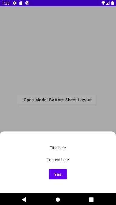
Main ScreenThis is the main screen that have a button to show or hide the bottom sheet.
@OptIn(ExperimentalMaterialApi::class)
@Composable
fun MainScreen(scope: CoroutineScope, state: ModalBottomSheetState) {
    Column(
        Modifier.fillMaxSize(),
        verticalArrangement = Arrangement.Center,
        horizontalAlignment = Alignment.CenterHorizontally
    ) {
        Button(
            colors = ButtonDefaults.buttonColors(
                backgroundColor = colorResource(id = R.color.white),
                contentColor = colorResource(id = R.color.black)
            ),
            onClick = {
                scope.launch {
                    state.show()
                }
            }) {
            Text(text = "Open Modal Bottom Sheet Layout")
        }
    }
}
Hide Bottom SheetThis will be handling the bottom sheet visibility
@OptIn(ExperimentalMaterialApi::class)
fun bottomSheetVisibility(coroutineScope: CoroutineScope, sheetState: ModalBottomSheetState){
    coroutineScope.launch {
        if (sheetState.currentValue == ModalBottomSheetValue.Hidden) {
            sheetState.show()
        } else {
            sheetState.hide()
        }
    }
}
You need to add the annotation @OptIn(ExperimentalMaterialApi::class) for every function that use BottomSheet, Android Studio or other IDE should tell you with a warning when it’s needed and just add it accordingly.
MainActivity
And now, we can call ModalBottomSheet on our Main Activity with only just 3 main parameters, which is Header , Content and Footer.
class MainActivity : ComponentActivity() {
override fun onCreate(savedInstanceState: Bundle?) {
super.onCreate(savedInstanceState)
setContent {
ModalBottomSheet(
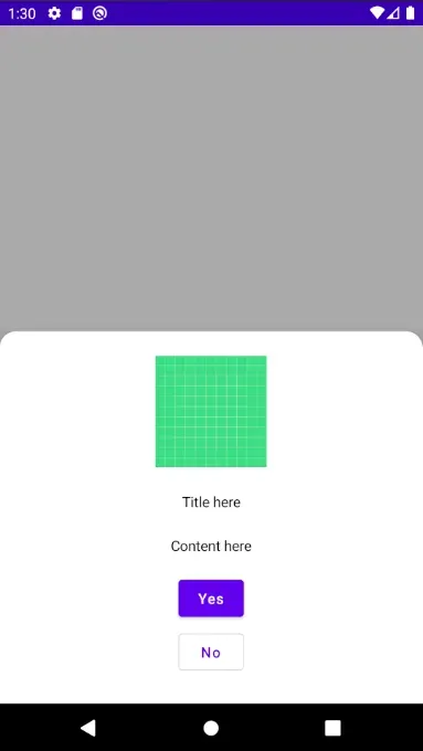
header = Header.HeaderImage("Title here", R.drawable.ic_launcher_background),
content = Content.Center("Content here"),
footer = Footer.ButtonMultiple("No", {} , "Yes", {})
)
}
}
}
And you can change the bottom sheet easily jusy by calling the variants that you wanted
ModalBottomSheet(
    header = Header.HeaderPlain("Title here"),
    content = Content.Center("Content here"),
    footer = Footer.ButtonSingle.PositiveButton("Yes", {
        Toast.makeText(this, "Yes Clicked", Toast.LENGTH_SHORT).show()
    })
)
You can access the source code here, and freely experiment with it. Source code: https://github.com/haneure/AndroidBottomSheet
Feel free to to comment, and tell me if there’s something I can improve with my code.
Reference
[1] Basics of Jetpack Compose[2] Standard Bottom Sheet[3] BottomSheetScaffold[4] Modifier[5] State and Jetpack Compose[6] StateHolder