Making Backward Compatible Adaptive Colors for Dark Mode in iOS
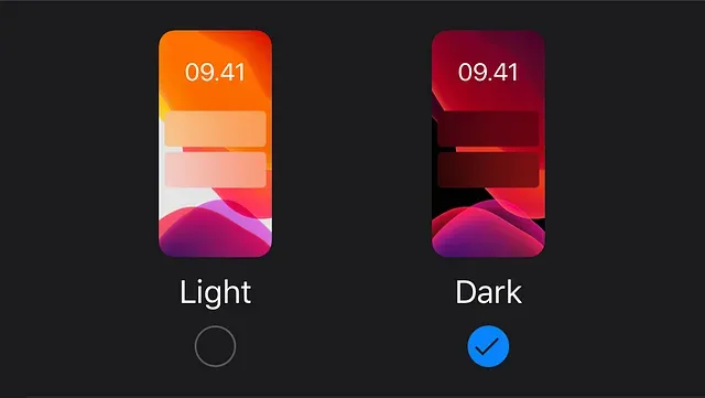
With the new iOS 13, we now have a new feature called “Dark Mode”. Using this feature, we can toggle between light appearance (dark content over light background) and dark appearance (light content over dark background) with a single button tap.

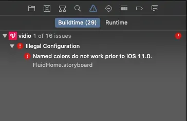
If your app’s minimum iOS supported version is iOS 11, this will be as easy as setting the colors and images in the Interface Builder using adaptive colors and images. First we must prepare the assets in our interface to support dark mode. And then set the colors accordingly in the Interface Builder. But what will happen if your app also support iOS 10 (like ours)? We will get an error when we try to build it like in the picture below.
Here in KMK Labs, we must still support iOS 10 for our Vidio iOS app. So, we have to use some workaround to solve this. Here’s how we solved this issue.
First we made an extension for UIColor to handle the custom colors like so:
extension UIColor {
    static let whiteFive = UIColor(red: 255, green: 255, blue: 255)
    static let whiteSeven = UIColor(red: 238, green: 238, blue: 238)
    static let blackTwo = UIColor(red: 51, green: 51, blue: 51)
    static let brownGrey = UIColor(red: 153, green: 153, blue: 153)
    static let greyish = UIColor(red: 178, green: 178, blue: 178)
    static let greyishBrown = UIColor(red: 68, green: 68, blue: 68)
    static let slateGrey = UIColor(red: 109, green: 109, blue: 114)
    static let black64 = UIColor(red: 51, green: 51, blue: 51, opacity: 0.64)
}
This way, we can just pick the custom colors directly from the IB. Bear in mind though, the colors themselves are not adaptive. Later on, these custom colors will be used as the entry point of the adaptive colors (via a custom color palette or just by setting the appropriate RGBA values themselves). So, stick around.
Now, you might be wondering what is that UIColor.init function with Integer parameters all about. It’s just an extendedconvenience init function that we have made ourselves.
extension UIColor {Now that we have the static constants of the colors that we want to make adaptive of, we should make the adaptive color assets themselves. We can make them in the Color.xcassets like this:
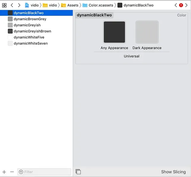
Any color that you want to make adaptive should have an entry in this assets. Pro tip: To calculate the Dark Appearance version of the color, just reduce the white RGB value (ie. RGB(255, 255, 255) ) by the RGB value of the color.
Afterwards, we added dynamic(color:) function extended from UIColor to get the adaptive color. We guard this function so that it will only be available in iOS 13. The reason we did this was we only need (and can) change dark mode in iOS 13, and in iOS 11 and 12, the dark mode is rather faulty (eg. some colors use light appearance while others use dark). The snippet of the code is like this:
extension UIColor {
    @available(iOS 13.0, *)
    static func dynamic(color: UIColor?) -> UIColor? {
        guard let color = color else { return nil }

        switch color {
        case .whiteFive: return UIColor(named: "dynamicWhiteFive")
        case .whiteSeven: return UIColor(named: "dynamicWhiteSeven")
        case .blackTwo: return UIColor(named: "dynamicBlackTwo")
        case .brownGrey: return UIColor(named: "dynamicBrownGrey")
        case .greyishBrown: return UIColor(named: "dynamicGreyishBrown")
        case .greyish: return UIColor(named: "dynamicGreyish")
        default:
            assertionFailure("undefined color: \(color)")
            return nil
         }
    }
}
The unit test:
@available(iOS 13, *)Our strategy was we will use a customIBInspectable to set the adaptive color of a property. Eg. if we want to set background color of a UIView to use adaptive color in iOS 13, we use this code:
extension UIView {
    @IBInspectable
    var themeBackgroundColor: UIColor? {
        get { return backgroundColor }
        set {
            guard HardcodedToggle.value(for: .useDynamicColors) else { return }
            if #available(iOS 13, *) {
                backgroundColor = UIColor.dynamic(color: newValue)
            }
        }
    }
}
The HardcodedToggle enum is the values for hardcoded toggle configuration to set whether or not we are using adaptive color or not, etc. Now this is where we found something peculiar. The unit test were all green but when we use the value from the IBInspectable the dynamic(color:) function didn’t work for some colors. After much debugging and logging, we found out that the RGB value returned from IBInspectable will be rounded up to 10 decimal point while if we created it programmatically, it won’t be rounded at all. Eg. 68 / 255 from IBInspectable will be returned as 0.2666666667 while if we created it manually it will return 0.266666666666666666… This broke the equatable of UIColors. So, we changed our custom UIColorconvenience init into this:
extension UIColor {
    convenience init(red: Int, green: Int, blue: Int, opacity: CGFloat = 1.0) {
        assert(red >= 0 && red <= 255, "Invalid red component")
        assert(green >= 0 && green <= 255, "Invalid green component")
        assert(blue >= 0 && blue <= 255, "Invalid blue component")
So, you might ask how do we use this in our project? Like what we have mentioned before, we set this on the properties that needed to be changed when the dark mode is toggled by using an IBInspectable so we can set it directly from the Interface Builder. For instance, in our project we need to set the background and border color of a UIView when we toggled the dark mode. So we added these:
extension UIView {
    @IBInspectable
    var themeBackgroundColor: UIColor? {
        get { return backgroundColor }
        set {
            guard HardcodedToggle.value(for: .useDynamicColors) else { return }
            if #available(iOS 13, *) {
                backgroundColor = UIColor.dynamic(color: newValue)
            }
        }
    }
So, if you want to add another property, for instance UILabel.textColor, you have to add a new IBInspectable. But what if you want to add a new adaptive color? Well, you must add another case in the dynamic(color:) function and a new adaptive color in Color.xcassets.
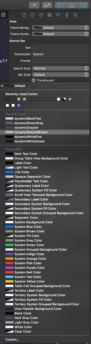
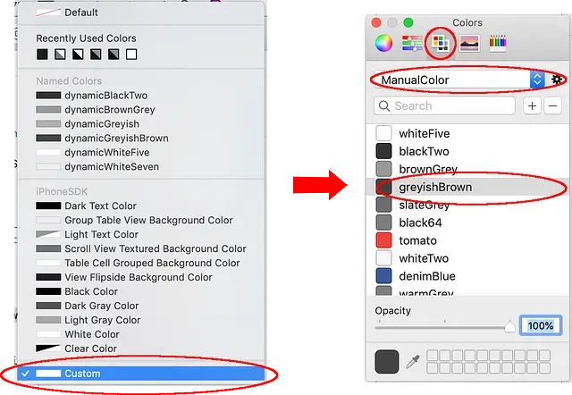
The last step should be how to pick the right color in the custom IBInspectable. You have two ways to do this:
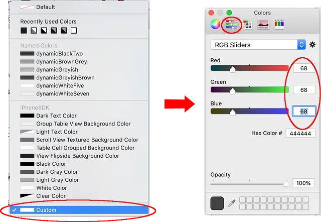
2. You can pick the color by their name in a custom color palette. First, you must click your new IBInspectable property and choose custom color. After that, pick the Color Palettesand open your custom color palette from the gear icon. Next, choose the name of the color (or create a new one if there isn’t any). Eg. for greyishBrown color, if there isn’t any in the list, we need to create a new one with a RGB value of (68, 68, 68). And then we should pick that color.
And, that’s it. We can now build the app that will change color if dark mode is toggled or it will fallback using the default value in older iOS versions. I hope this will be useful for you. Thank you for taking your time to read this article.